---
title: "Everything Palettes in R: Viridis, Brewer, and Beyond"
subtitle: "A comprehensive guide to color palettes in ggplot2"
execute:
warning: false
message: false
author: "Noah Weidig"
date: "2026-02-24"
categories: [code, ggplot2, dataviz, color]
description: "Master color palettes in ggplot2 — from viridis and RColorBrewer to MetBrewer, wesanderson, and more. Learn when to use continuous vs discrete scales, how to design for colorblind accessibility, and how to avoid common pitfalls."
toc: true
toc-depth: 2
code-fold: show
---
Color can make or break a figure. The right palette draws attention to the story in your data; the wrong one buries it under visual noise. In this post we will walk through the major palette ecosystems available in R, learn when to reach for each one, and pick up practical rules that keep figures readable, accessible, and honest.
# Setup
We will use several packages throughout this tutorial. Install any you are missing, then load them all at once.
```{r}
#| label: setup
# Uncomment to install any missing packages
# install.packages(c(
#   "ggplot2", "dplyr", "scales", "viridis",
#   "RColorBrewer", "colorspace", "paletteer",
#   "scico", "MetBrewer", "wesanderson", "ggsci",
#   "rcartocolor", "palmerpenguins", "khroma"
# ))

library(ggplot2)
library(dplyr)
library(scales)
library(viridis)
library(RColorBrewer)
library(colorspace)
library(paletteer)
library(scico)
library(MetBrewer)
library(wesanderson)
library(ggsci)
library(rcartocolor)
library(palmerpenguins)
library(khroma)
```
We will rely on the **palmerpenguins** dataset for most examples. It gives us both categorical variables (`species`, `island`) and continuous ones (`bill_length_mm`, `body_mass_g`).
```{r}
penguins <- palmerpenguins::penguins
glimpse(penguins)
```
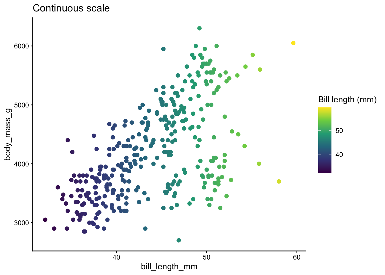
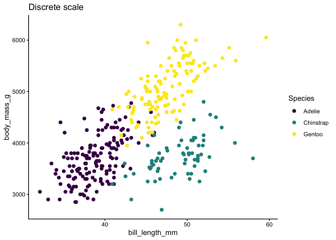
# Continuous vs Discrete Color Scales
Before choosing a palette, decide whether the variable you are mapping to color is **continuous** (numeric) or **discrete** (categorical).
In ggplot2:
- **Continuous** variables use `scale_color_*()` / `scale_fill_*()` functions that interpolate between colors.
- **Discrete** variables use functions that assign one distinct color per level.
Many palette packages offer both variants. Here is a quick comparison.
```{r}
#| label: continuous-vs-discrete
# Continuous: bill length mapped to a gradient
p_cont <- ggplot(penguins, aes(x = bill_length_mm, y = body_mass_g,
                                color = bill_length_mm)) +
  geom_point(size = 2, na.rm = TRUE) +
  scale_color_viridis_c() +
  labs(title = "Continuous scale", color = "Bill length (mm)") +
  theme_classic()

# Discrete: species mapped to distinct colors
p_disc <- ggplot(penguins, aes(x = bill_length_mm, y = body_mass_g,
                                color = species)) +
  geom_point(size = 2, na.rm = TRUE) +
  scale_color_viridis_d() +
  labs(title = "Discrete scale", color = "Species") +
  theme_classic()

p_cont
p_disc
```
**Rule of thumb:** continuous scales for numbers, discrete scales for categories.
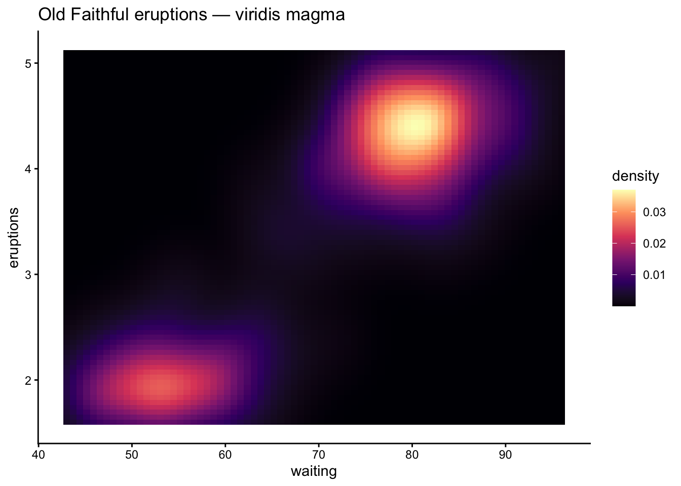
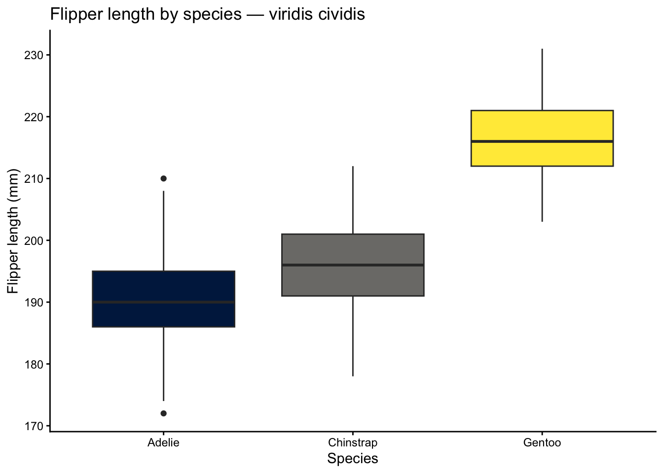
# Viridis (viridis / viridisLite)
The **viridis** family is the gold standard for perceptually uniform, colorblind-safe palettes. The colors change smoothly in lightness and chroma, so a plot printed in grayscale still makes sense.
**Sub-palettes:** `viridis`, `magma`, `inferno`, `plasma`, `cividis`, `rocket`, `mako`, `turbo`.
**When to use:** any time you need a safe default for continuous data, heatmaps, or ordered categories.
```{r}
#| label: viridis-continuous
ggplot(faithfuld, aes(waiting, eruptions, fill = density)) +
  geom_tile() +
  scale_fill_viridis_c(option = "magma") +
  labs(title = "Old Faithful eruptions — viridis magma") +
  theme_classic()
```
```{r}
#| label: viridis-discrete
ggplot(penguins, aes(x = species, y = flipper_length_mm,
                      fill = species)) +
  geom_boxplot(na.rm = TRUE, show.legend = FALSE) +
  scale_fill_viridis_d(option = "cividis") +
  labs(title = "Flipper length by species — viridis cividis",
       x = "Species", y = "Flipper length (mm)") +
  theme_classic()
```
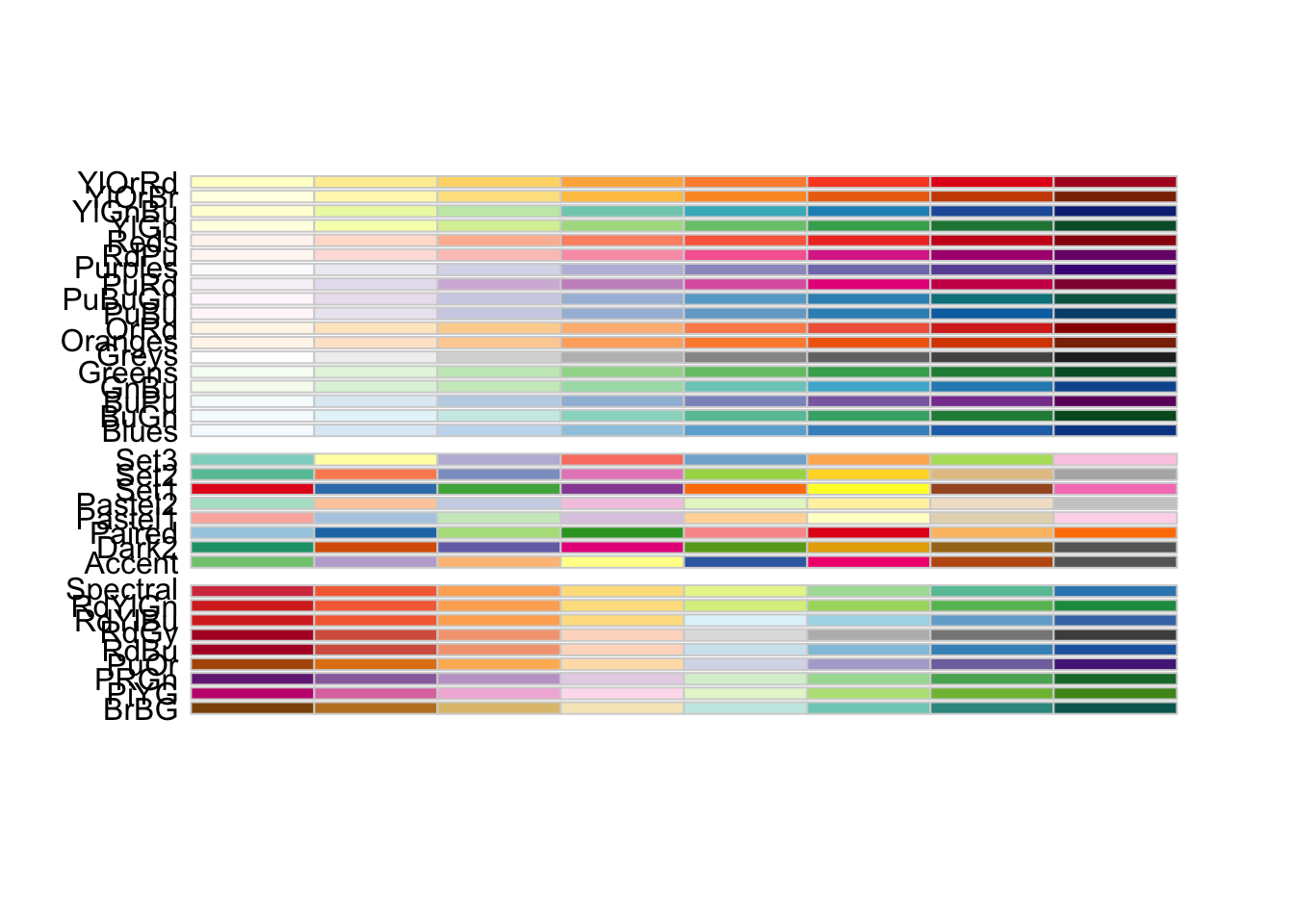
# RColorBrewer
**RColorBrewer** provides three palette families designed by cartographer Cynthia Brewer:
| Type | Purpose | Example palettes |
|------|---------|-----------------|
| Sequential | Low-to-high values | Blues, YlOrRd, Greens |
| Diverging | Deviation from a midpoint | RdBu, BrBG, PiYG |
| Qualitative | Unordered categories | Set2, Paired, Dark2 |
**When to use:** you need a well-tested, publication-ready palette and want to choose the family explicitly.
```{r}
#| label: brewer-overview
# Display available palettes
display.brewer.all(n = 8)
```
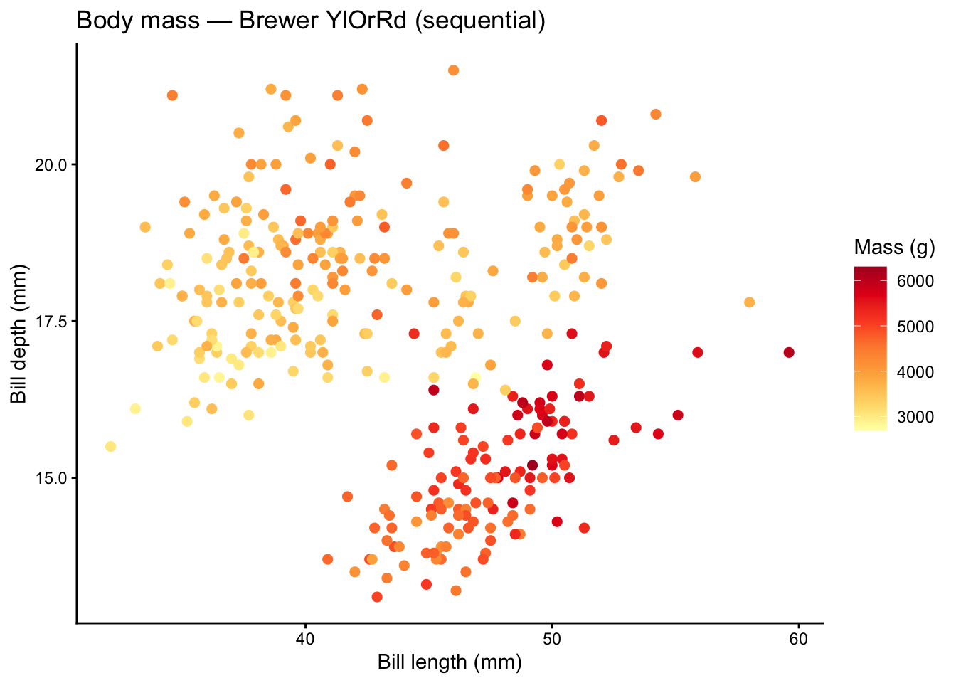
```{r}
#| label: brewer-sequential
ggplot(penguins, aes(x = bill_length_mm, y = bill_depth_mm,
                      color = body_mass_g)) +
  geom_point(size = 2, na.rm = TRUE) +
  scale_color_distiller(palette = "YlOrRd", direction = 1) +
  labs(title = "Body mass — Brewer YlOrRd (sequential)",
       x = "Bill length (mm)", y = "Bill depth (mm)",
       color = "Mass (g)") +
  theme_classic()
```
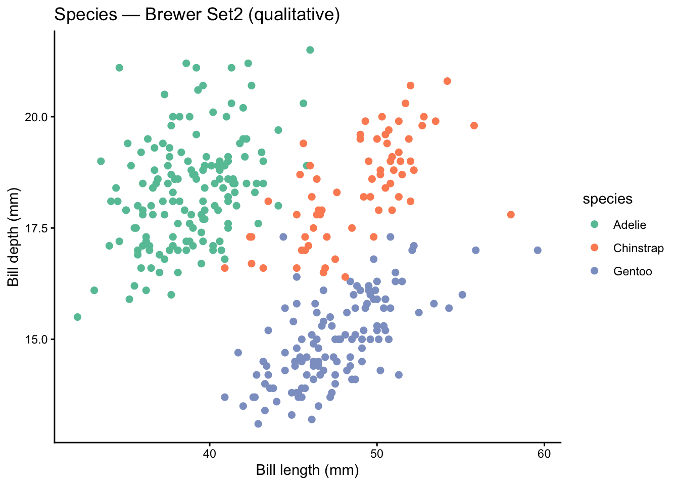
```{r}
#| label: brewer-qualitative
ggplot(penguins, aes(x = bill_length_mm, y = bill_depth_mm,
                      color = species)) +
  geom_point(size = 2, na.rm = TRUE) +
  scale_color_brewer(palette = "Set2") +
  labs(title = "Species — Brewer Set2 (qualitative)",
       x = "Bill length (mm)", y = "Bill depth (mm)") +
  theme_classic()
```
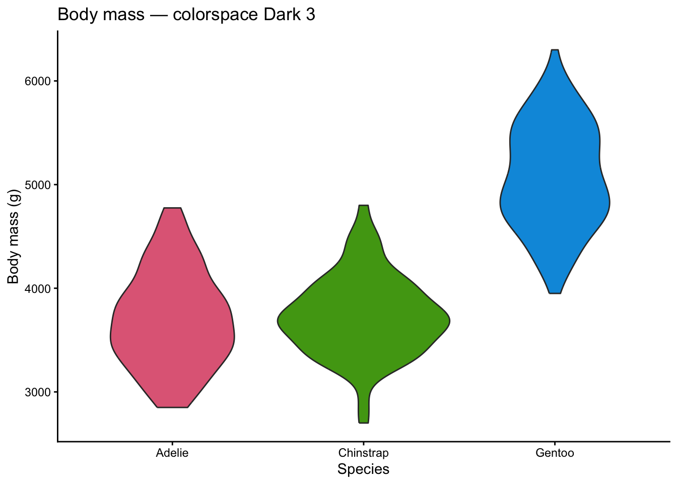
# colorspace
The **colorspace** package lets you build palettes from scratch using perceptual color spaces (HCL). It ships ready-made palettes and diagnostic tools.
**When to use:** you want fine control over hue, chroma, and luminance or need to evaluate existing palettes.
```{r}
#| label: colorspace-qualitative
ggplot(penguins, aes(x = species, y = body_mass_g, fill = species)) +
  geom_violin(na.rm = TRUE, show.legend = FALSE) +
  scale_fill_discrete_qualitative(palette = "Dark 3") +
  labs(title = "Body mass — colorspace Dark 3",
       x = "Species", y = "Body mass (g)") +
  theme_classic()
```
```{r}
#| label: colorspace-sequential
ggplot(faithfuld, aes(waiting, eruptions, fill = density)) +
geom_tile() +
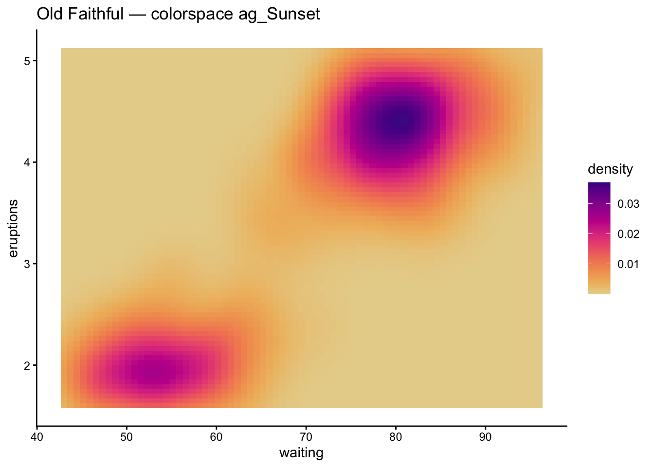
scale_fill_continuous_sequential(palette = "ag_Sunset") +
labs(title = "Old Faithful — colorspace ag_Sunset") +
theme_classic()
```
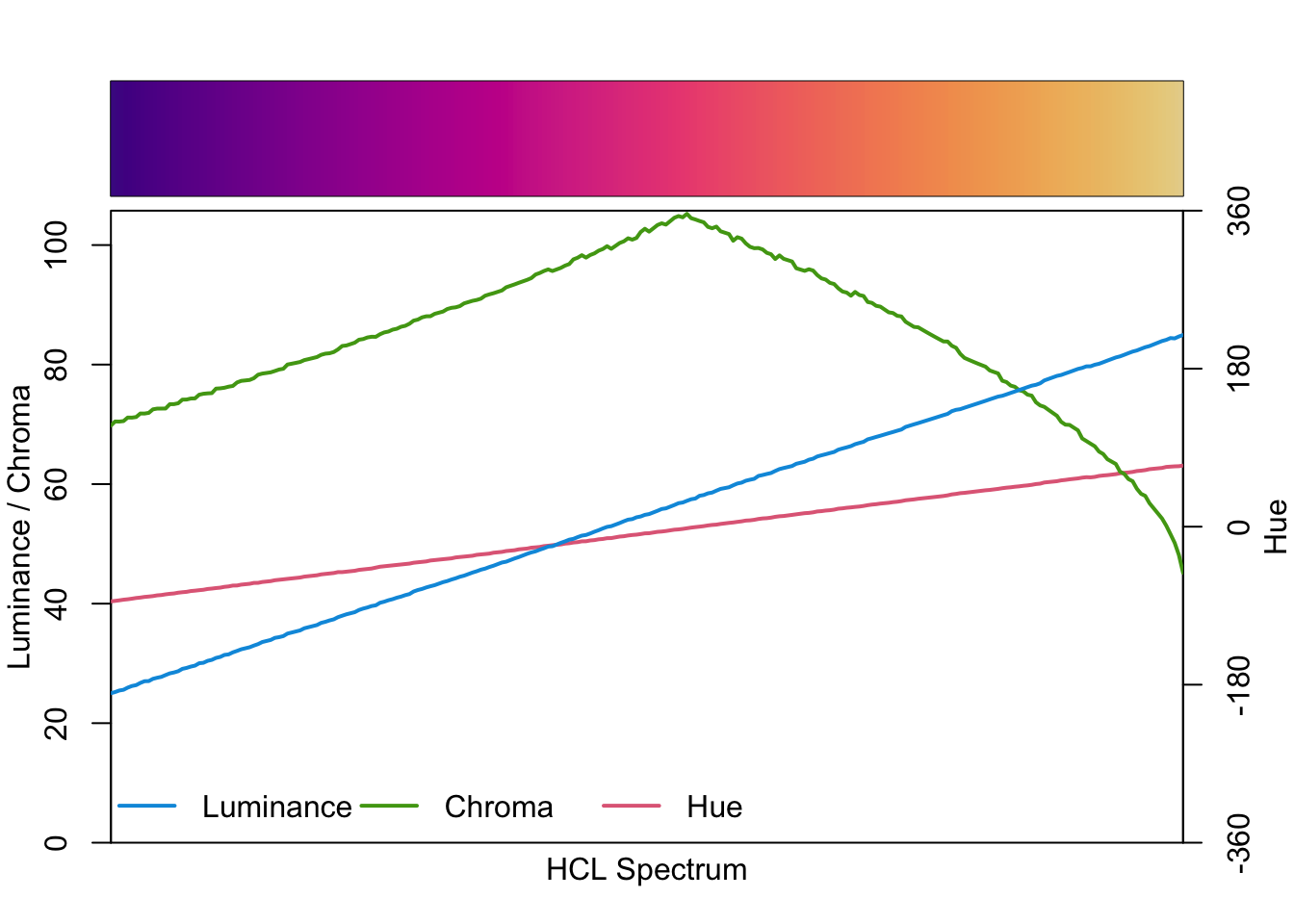
A powerful diagnostic: `colorspace::specplot()` shows how lightness, chroma, and hue vary across a palette.
```{r}
#| label: colorspace-specplot
colorspace::specplot(colorspace::sequential_hcl(256, palette = "ag_Sunset"))
```
# paletteer
**paletteer** is a meta-package that gives you a unified interface to hundreds of palettes from dozens of packages.
**When to use:** you want to browse or switch between palettes without loading each individual package.
```{r}
#| label: paletteer-discrete
ggplot(penguins, aes(x = bill_length_mm, y = body_mass_g,
color = species)) +
geom_point(size = 2, na.rm = TRUE) +
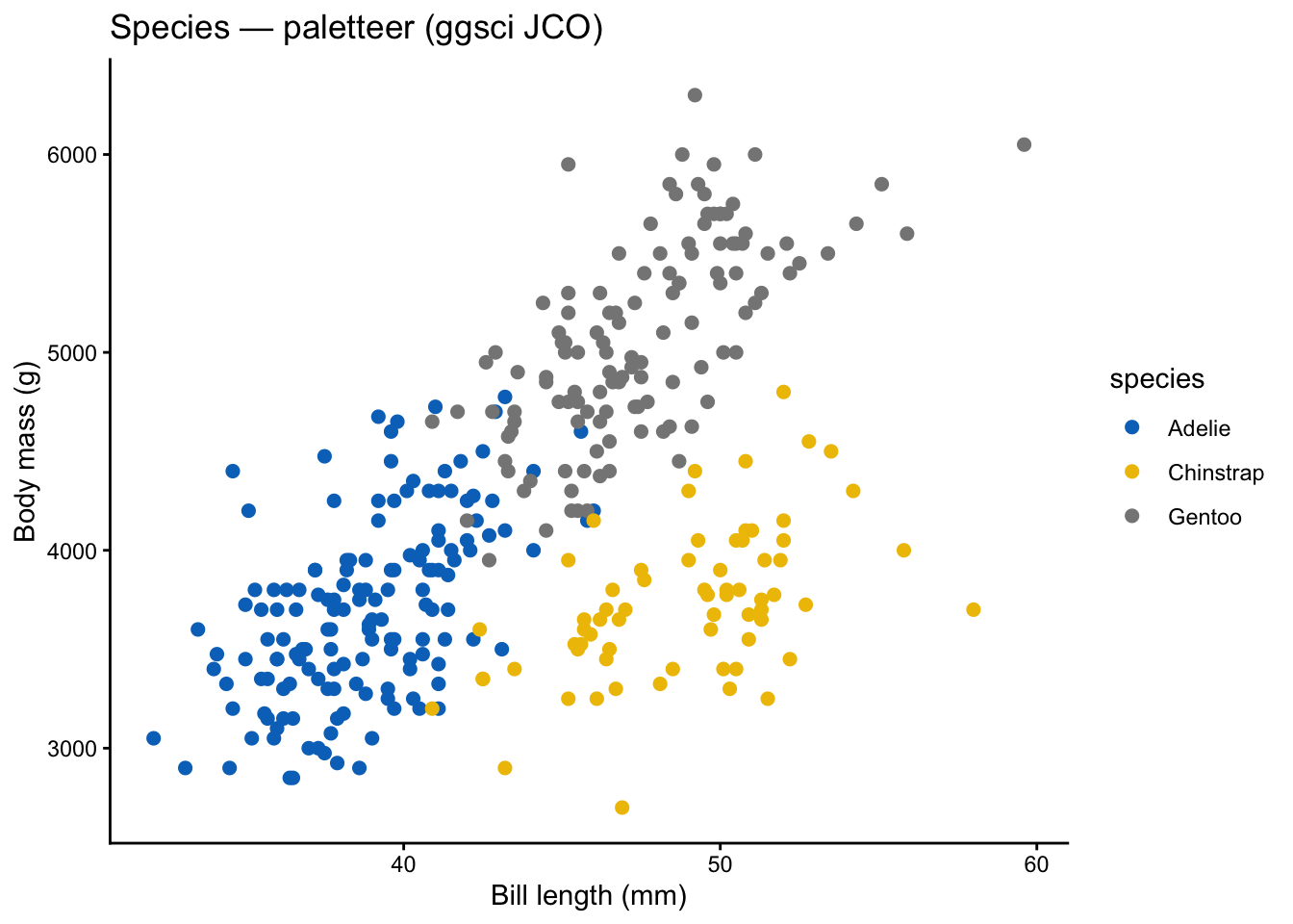
paletteer::scale_color_paletteer_d("ggsci::default_jco") +
labs(title = "Species — paletteer (ggsci JCO)",
x = "Bill length (mm)", y = "Body mass (g)") +
theme_classic()
```
```{r}
#| label: paletteer-continuous
ggplot(penguins, aes(x = bill_length_mm, y = bill_depth_mm,
color = body_mass_g)) +
geom_point(size = 2, na.rm = TRUE) +
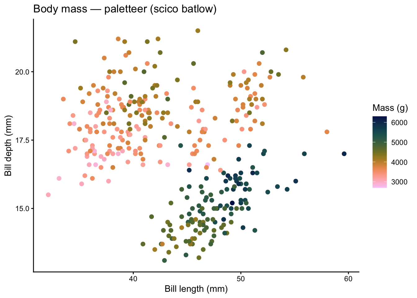
paletteer::scale_color_paletteer_c("scico::batlow", direction = -1) +
labs(title = "Body mass — paletteer (scico batlow)",
x = "Bill length (mm)", y = "Bill depth (mm)",
color = "Mass (g)") +
theme_classic()
```
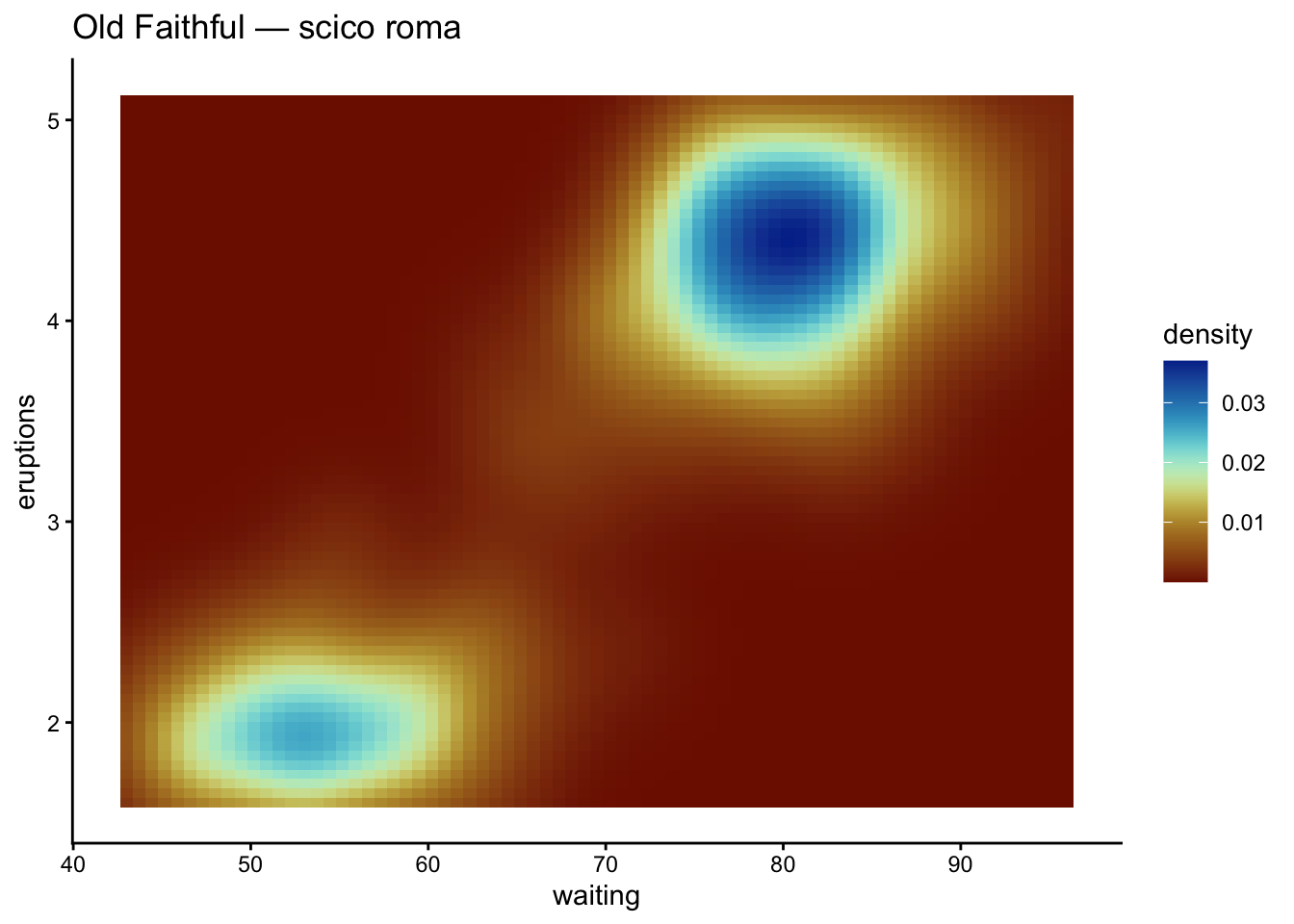
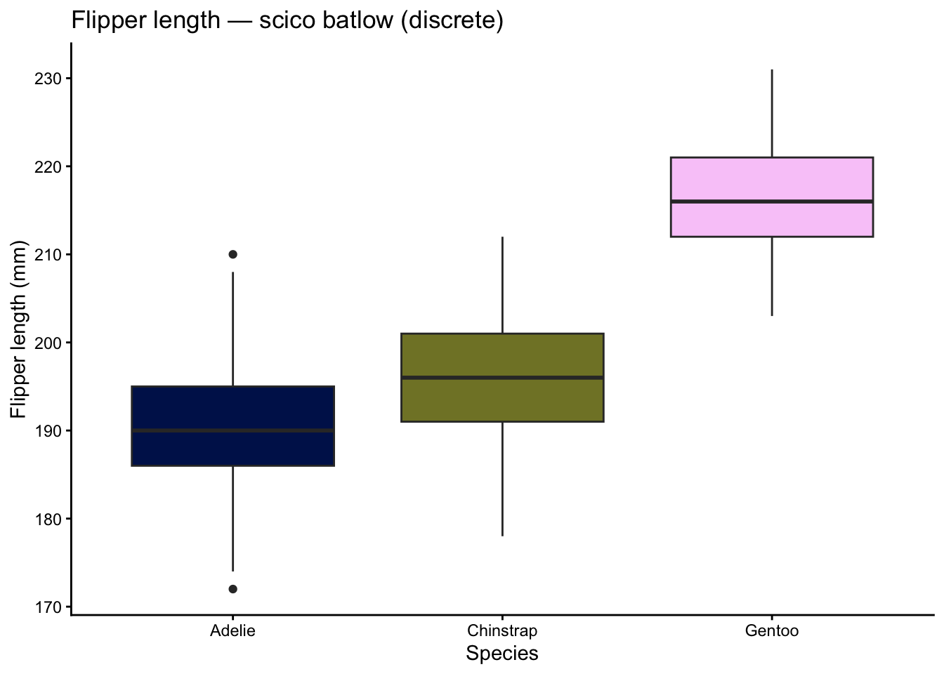
# scico
**scico** provides perceptually uniform, colorblind-safe scientific colour maps developed by Fabio Crameri.
**When to use:** earth science, oceanography, or any continuous data where perceptual uniformity is critical.
```{r}
#| label: scico-continuous
ggplot(faithfuld, aes(waiting, eruptions, fill = density)) +
  geom_tile() +
  scico::scale_fill_scico(palette = "roma") +
  labs(title = "Old Faithful — scico roma") +
  theme_classic()
```
```{r}
#| label: scico-discrete
ggplot(penguins, aes(x = species, y = flipper_length_mm,
                      fill = species)) +
  geom_boxplot(na.rm = TRUE, show.legend = FALSE) +
  scico::scale_fill_scico_d(palette = "batlow") +
  labs(title = "Flipper length — scico batlow (discrete)",
       x = "Species", y = "Flipper length (mm)") +
  theme_classic()
```
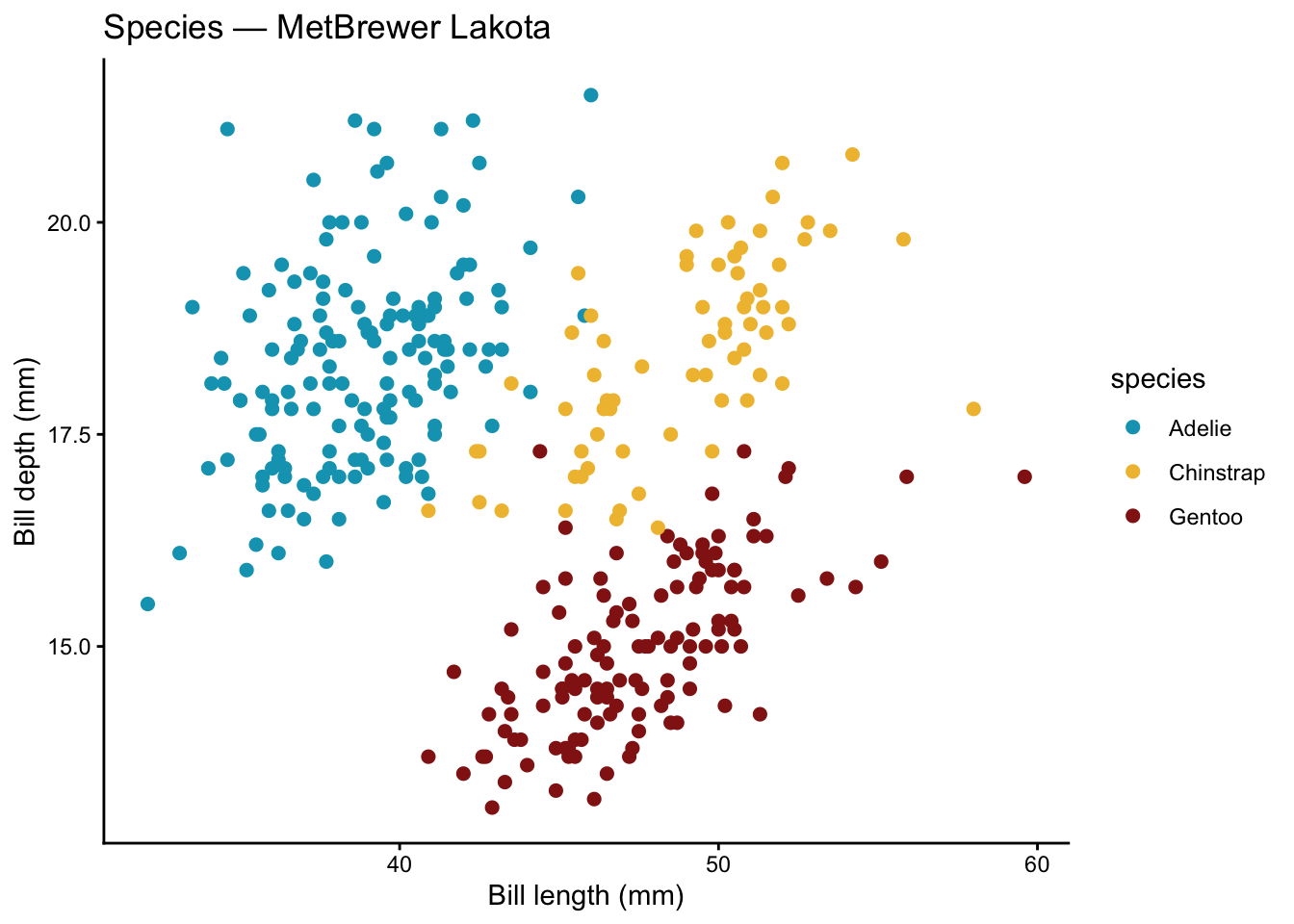
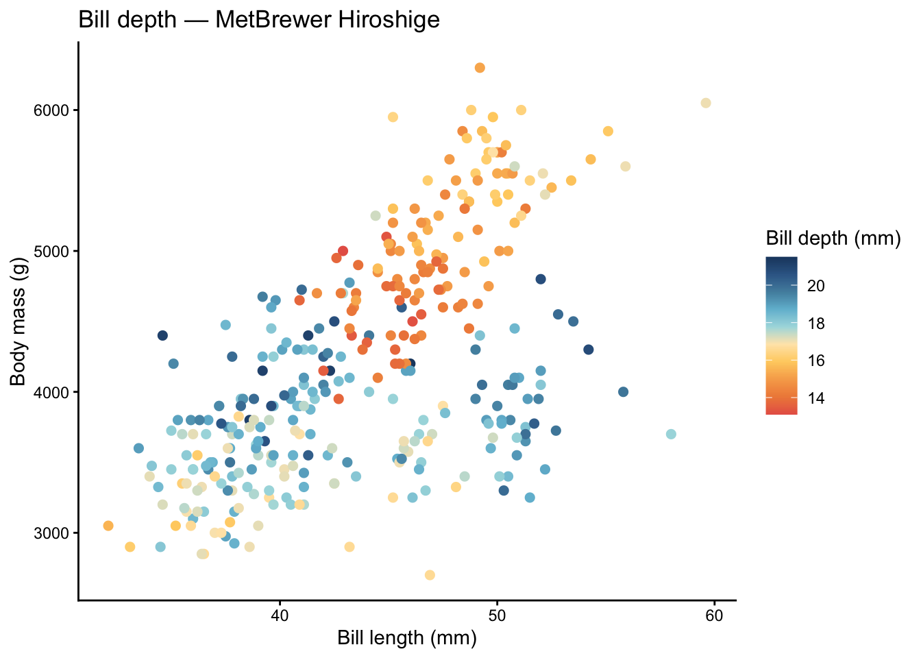
# MetBrewer
**MetBrewer** offers palettes inspired by works at the Metropolitan Museum of Art. They are visually striking and still colorblind-friendly.
**When to use:** presentations, posters, or publications where you want an artistic aesthetic without sacrificing readability.
```{r}
#| label: metbrewer-discrete
ggplot(penguins, aes(x = bill_length_mm, y = bill_depth_mm,
                      color = species)) +
  geom_point(size = 2, na.rm = TRUE) +
  MetBrewer::scale_color_met_d("Lakota") +
  labs(title = "Species — MetBrewer Lakota",
       x = "Bill length (mm)", y = "Bill depth (mm)") +
  theme_classic()
```
```{r}
#| label: metbrewer-continuous
ggplot(penguins, aes(x = bill_length_mm, y = body_mass_g,
                      color = bill_depth_mm)) +
  geom_point(size = 2, na.rm = TRUE) +
  MetBrewer::scale_color_met_c("Hiroshige") +
  labs(title = "Bill depth — MetBrewer Hiroshige",
       x = "Bill length (mm)", y = "Body mass (g)",
       color = "Bill depth (mm)") +
  theme_classic()
```
# wesanderson
**wesanderson** provides palettes inspired by the films of Wes Anderson — charming pastels and earthy tones.
**When to use:** informal presentations, blog graphics, or any context where personality is a plus. These are primarily discrete palettes.
```{r}
#| label: wesanderson-plot
ggplot(penguins, aes(x = species, y = body_mass_g, fill = species)) +
geom_boxplot(na.rm = TRUE, show.legend = FALSE) +
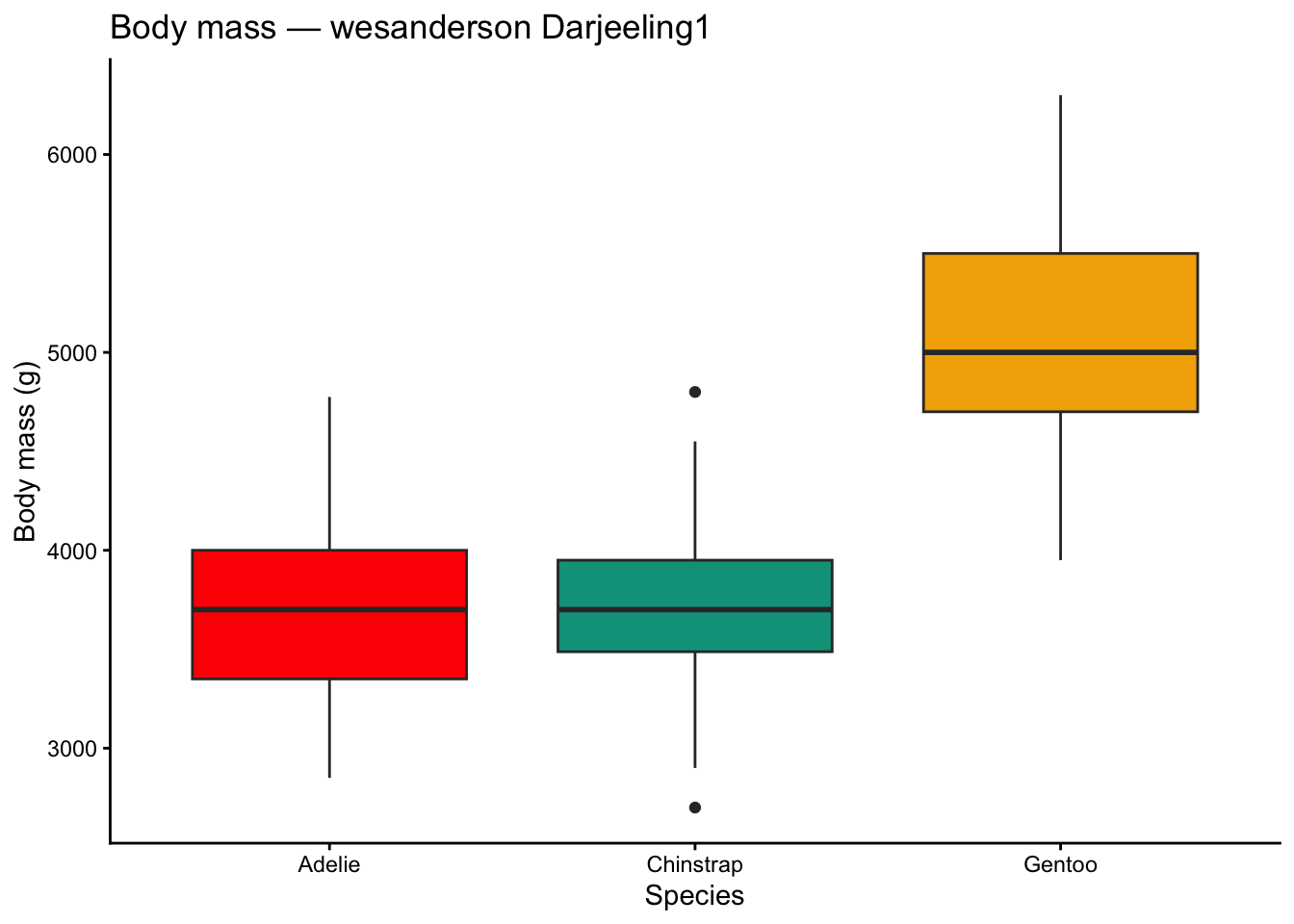
scale_fill_manual(values = wes_palette("Darjeeling1", 3)) +
labs(title = "Body mass — wesanderson Darjeeling1",
x = "Species", y = "Body mass (g)") +
theme_classic()
```
```{r}
#| label: wesanderson-scatter
ggplot(penguins, aes(x = bill_length_mm, y = flipper_length_mm,
color = island)) +
geom_point(size = 2, na.rm = TRUE) +
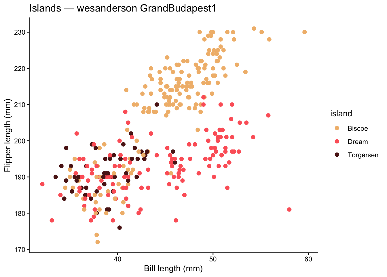
scale_color_manual(values = wes_palette("GrandBudapest1", 3)) +
labs(title = "Islands — wesanderson GrandBudapest1",
x = "Bill length (mm)", y = "Flipper length (mm)") +
theme_classic()
```
# ggsci
**ggsci** provides color palettes from scientific journals and sci-fi franchises (JAMA, Lancet, NEJM, Nature, Star Trek, and more).
**When to use:** journal submissions where you want colors that match the publication's own figures, or when you need a conservative, professional palette.
```{r}
#| label: ggsci-jco
ggplot(penguins, aes(x = bill_length_mm, y = body_mass_g,
color = species)) +
geom_point(size = 2, na.rm = TRUE) +
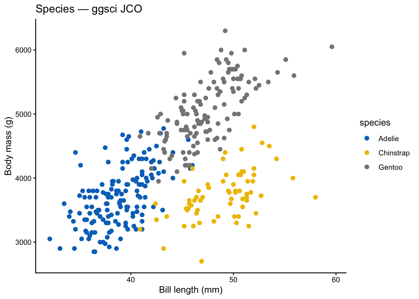
ggsci::scale_color_jco() +
labs(title = "Species — ggsci JCO",
x = "Bill length (mm)", y = "Body mass (g)") +
theme_classic()
```
```{r}
#| label: ggsci-nejm
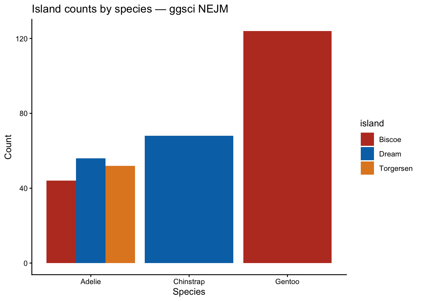
ggplot(penguins, aes(x = species, fill = island)) +
  geom_bar(position = "dodge") +
  ggsci::scale_fill_nejm() +
  labs(title = "Island counts by species — ggsci NEJM",
       x = "Species", y = "Count") +
  theme_classic()
```
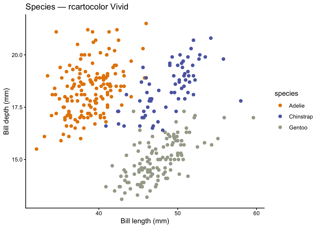
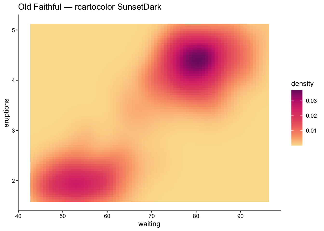
# rcartocolor
**rcartocolor** provides the CARTOColors palettes, designed for cartography. They include sequential, diverging, and qualitative schemes that work well in maps and standard plots alike.
**When to use:** maps, geographic data, or when you want palettes designed for spatial visualization.
```{r}
#| label: rcartocolor-qualitative
ggplot(penguins, aes(x = bill_length_mm, y = bill_depth_mm,
                      color = species)) +
  geom_point(size = 2, na.rm = TRUE) +
  rcartocolor::scale_color_carto_d(palette = "Vivid") +
  labs(title = "Species — rcartocolor Vivid",
       x = "Bill length (mm)", y = "Bill depth (mm)") +
  theme_classic()
```
```{r}
#| label: rcartocolor-continuous
ggplot(faithfuld, aes(waiting, eruptions, fill = density)) +
  geom_tile() +
  rcartocolor::scale_fill_carto_c(palette = "SunsetDark") +
  labs(title = "Old Faithful — rcartocolor SunsetDark") +
  theme_classic()
```
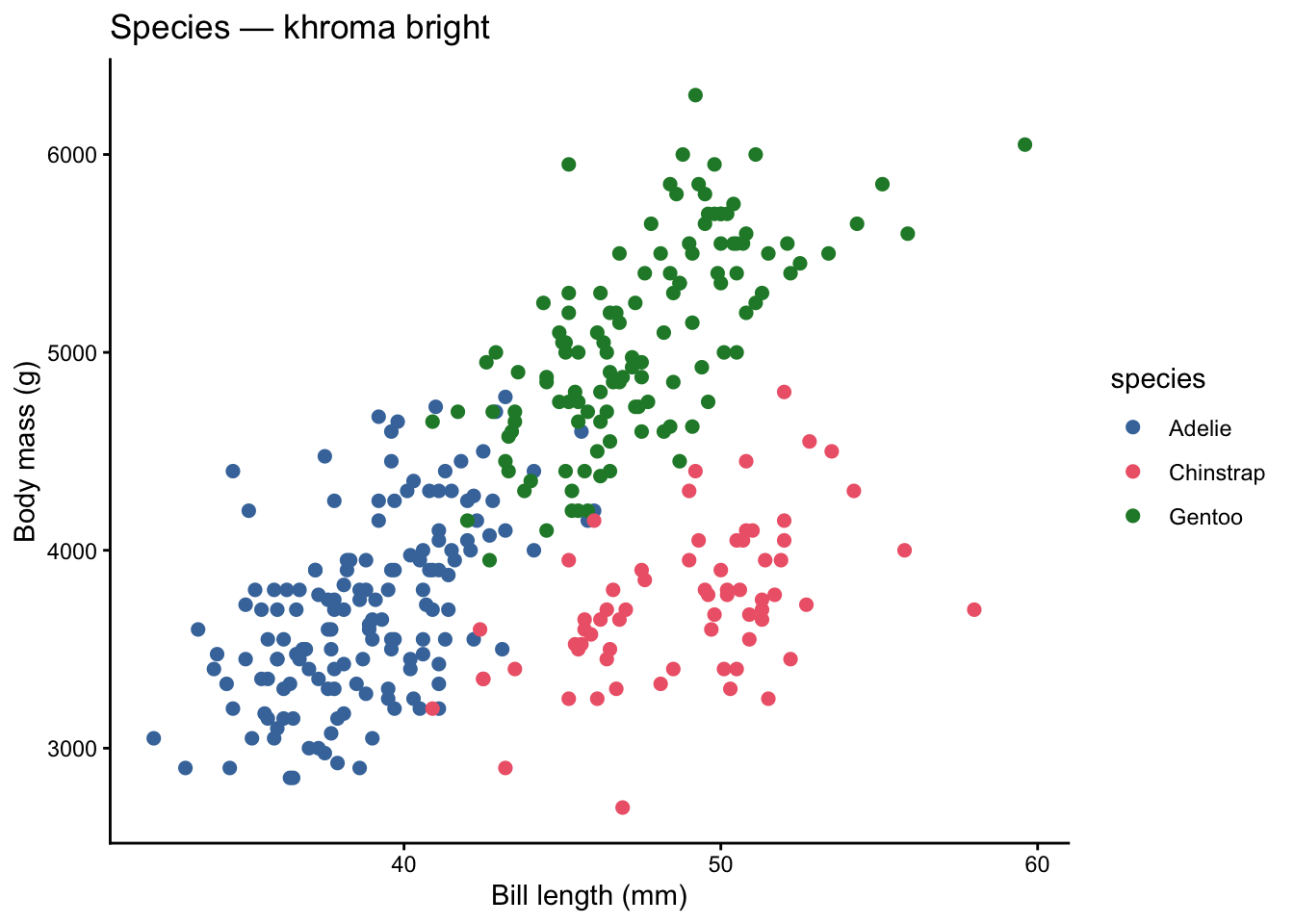
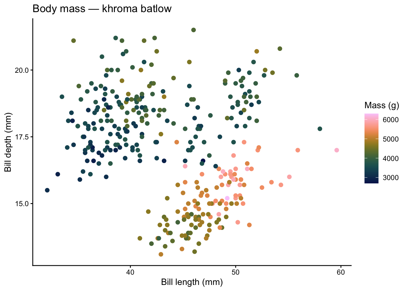
# khroma
**khroma** provides colour schemes for scientific data visualization, with a strong focus on accessibility. All palettes are designed to be distinct for people with colour vision deficiencies.
**When to use:** scientific figures where accessibility is non-negotiable and you want assurance the palette has been tested for CVD safety.
```{r}
#| label: khroma-discrete
ggplot(penguins, aes(x = bill_length_mm, y = body_mass_g,
                      color = species)) +
  geom_point(size = 2, na.rm = TRUE) +
  khroma::scale_color_bright() +
  labs(title = "Species — khroma bright",
       x = "Bill length (mm)", y = "Body mass (g)") +
  theme_classic()
```
```{r}
#| label: khroma-continuous
ggplot(penguins, aes(x = bill_length_mm, y = bill_depth_mm,
                      color = body_mass_g)) +
  geom_point(size = 2, na.rm = TRUE) +
  khroma::scale_color_batlow() +
  labs(title = "Body mass — khroma batlow",
       x = "Bill length (mm)", y = "Bill depth (mm)",
       color = "Mass (g)") +
  theme_classic()
```
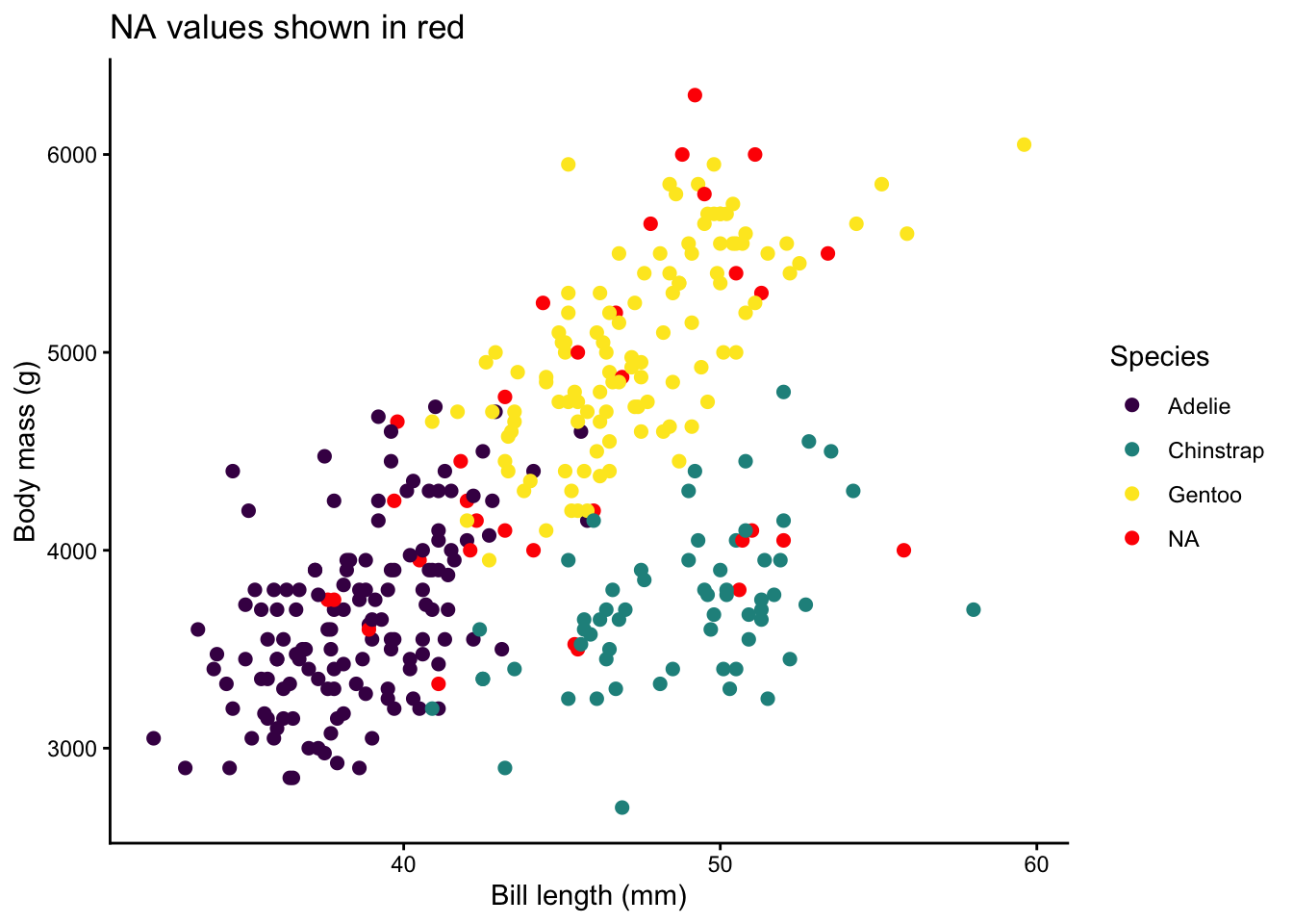
# Handling NA Colors
Missing values appear in almost every real dataset. By default ggplot2 maps `NA` to grey, but you can control this.
```{r}
#| label: na-colors
# Create some NAs for demonstration
penguins_na <- penguins |>
  mutate(species_na = if_else(row_number() %% 10 == 0, NA_character_, as.character(species)))

ggplot(penguins_na, aes(x = bill_length_mm, y = body_mass_g,
                         color = species_na)) +
  geom_point(size = 2, na.rm = TRUE) +
  scale_color_viridis_d(na.value = "red") +
  labs(title = "NA values shown in red",
       x = "Bill length (mm)", y = "Body mass (g)",
       color = "Species") +
  theme_classic()
```
Use `na.value =` inside any `scale_color_*()` or `scale_fill_*()` call to set the NA color. Common choices:
- `"grey50"` — subtle, does not draw attention
- `"red"` or `"black"` — highlights missing data for QC
- `NA` — removes NA points from the legend entirely
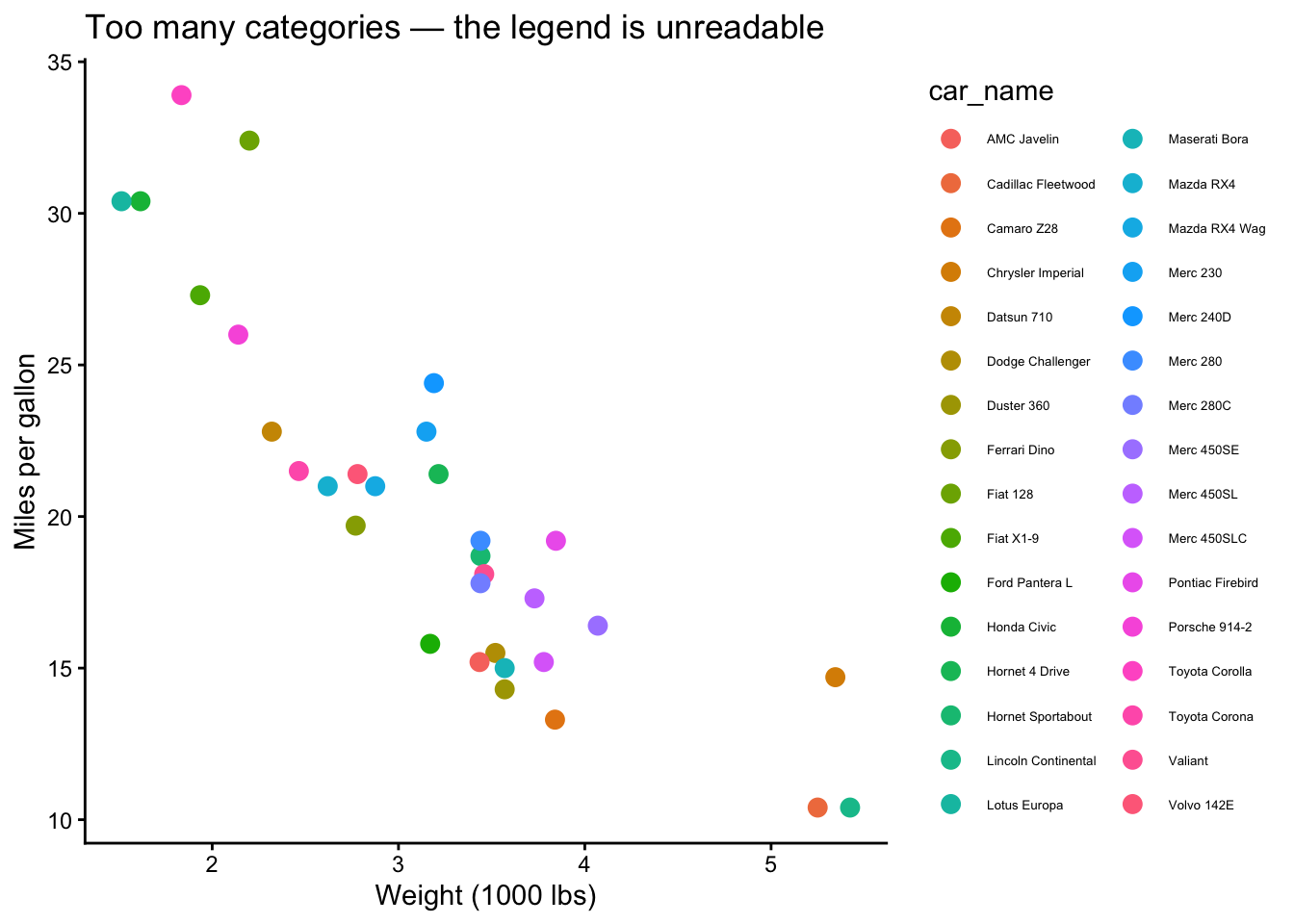
# Practical Rules for Number of Colors
## The 6–8 Rule
Humans can reliably distinguish roughly **6 to 8** hues at a glance. Beyond that, colors start to blur together, especially in scatterplots where points overlap. Here is what happens when you push it.
```{r}
#| label: too-many-colors
# mtcars has many cylinder + gear combos — let's create a busy variable
mtcars_busy <- mtcars |>
  mutate(car_name = rownames(mtcars))

ggplot(mtcars_busy, aes(x = wt, y = mpg, color = car_name)) +
  geom_point(size = 3) +
  labs(title = "Too many categories — the legend is unreadable",
       x = "Weight (1000 lbs)", y = "Miles per gallon") +
  theme_classic() +
  theme(legend.text = element_text(size = 5))
```
That is a mess. Here are your escape hatches:
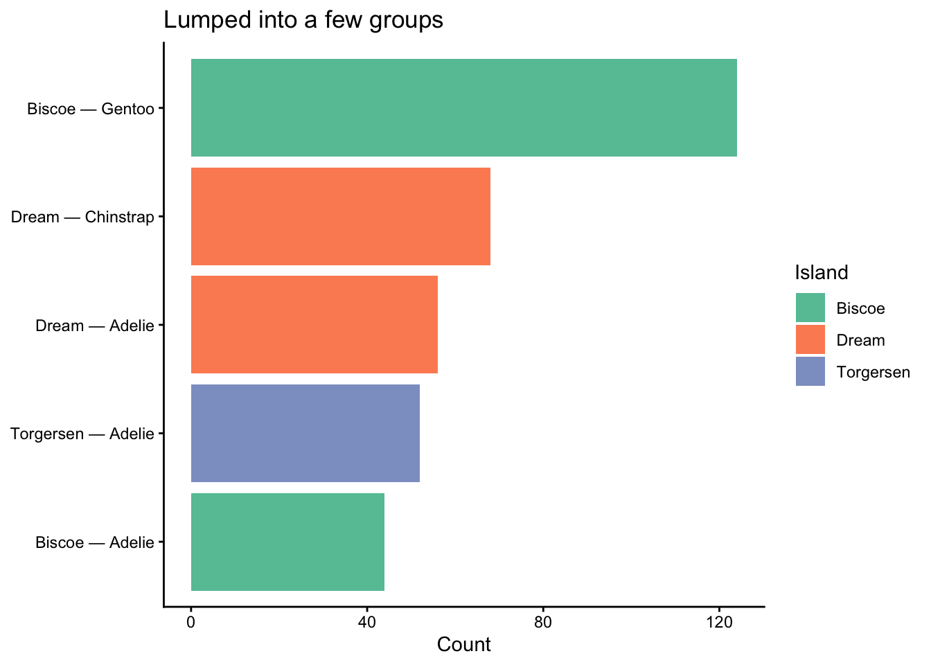
### Fix 1: Lump rare categories
```{r}
#| label: fix-lump
penguins_islands <- penguins |>
  count(island, species) |>
  mutate(label = paste(island, species, sep = " — "))

# Works fine with a manageable number of groups
ggplot(penguins_islands, aes(x = reorder(label, n), y = n, fill = island)) +
  geom_col(show.legend = TRUE) +
  coord_flip() +
  scale_fill_brewer(palette = "Set2") +
  labs(title = "Lumped into a few groups",
       x = NULL, y = "Count", fill = "Island") +
  theme_classic()
```
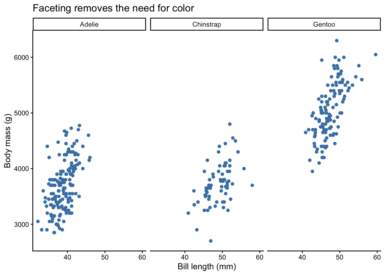
### Fix 2: Facet instead of coloring
```{r}
#| label: fix-facet
ggplot(penguins, aes(x = bill_length_mm, y = body_mass_g)) +
  geom_point(size = 1.5, na.rm = TRUE, color = "steelblue") +
  facet_wrap(~ species) +
  labs(title = "Faceting removes the need for color",
       x = "Bill length (mm)", y = "Body mass (g)") +
  theme_classic()
```
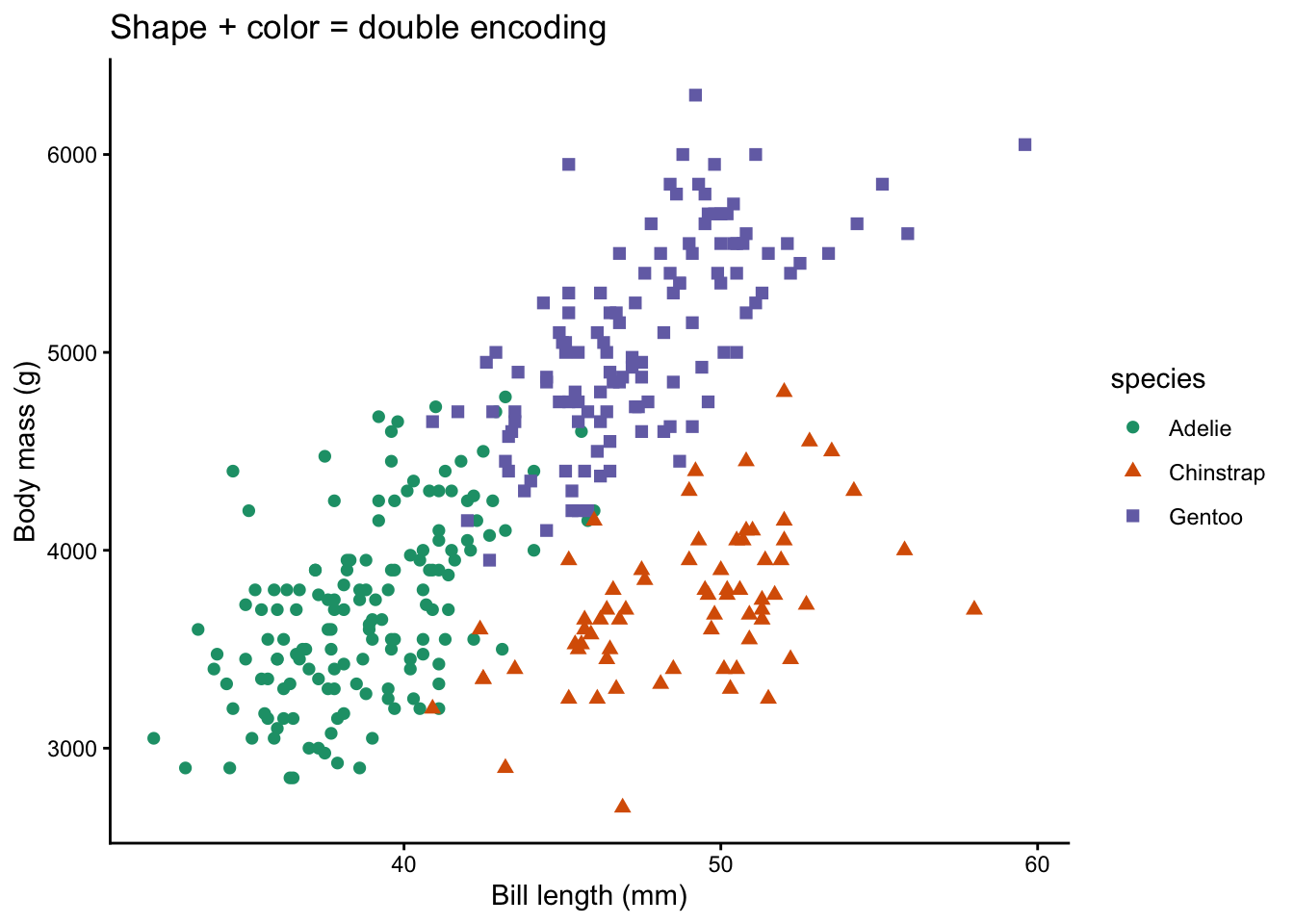
### Fix 3: Use shape or linetype in addition to color
```{r}
#| label: fix-shape
ggplot(penguins, aes(x = bill_length_mm, y = body_mass_g,
                      color = species, shape = species)) +
  geom_point(size = 2, na.rm = TRUE) +
  scale_color_brewer(palette = "Dark2") +
  labs(title = "Shape + color = double encoding",
       x = "Bill length (mm)", y = "Body mass (g)") +
  theme_classic()
```
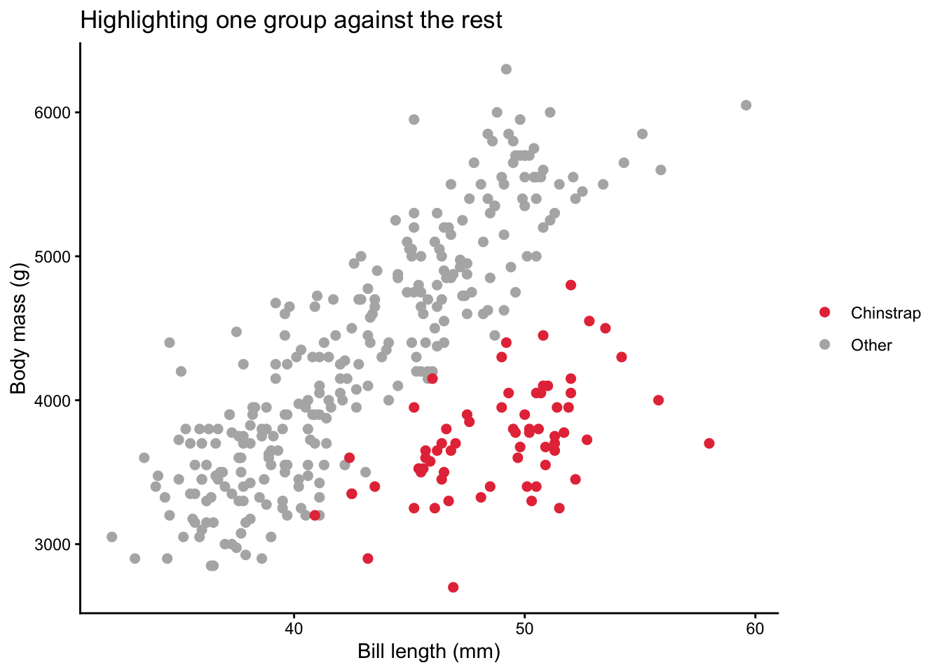
### Fix 4: Highlight one group, grey the rest
```{r}
#| label: fix-highlight
penguins_hl <- penguins |>
  mutate(highlight = if_else(species == "Chinstrap", "Chinstrap", "Other"))

ggplot(penguins_hl, aes(x = bill_length_mm, y = body_mass_g,
                         color = highlight)) +
  geom_point(size = 2, na.rm = TRUE) +
  scale_color_manual(values = c("Chinstrap" = "#E63946", "Other" = "grey70")) +
  labs(title = "Highlighting one group against the rest",
       x = "Bill length (mm)", y = "Body mass (g)",
       color = NULL) +
  theme_classic()
```
# Accessibility: Contrast & Colorblind-Friendly Design
Approximately 8% of men and 0.5% of women have some form of color vision deficiency (CVD). Designing for accessibility is not optional — it is good science.
## Key Principles
1. **Never rely on color alone.** Pair color with shape, size, or labels.
2. **Use perceptually uniform palettes.** Viridis, scico, and khroma are safe bets.
3. **Avoid red-green contrasts.** The most common CVD type (deuteranopia) confuses red and green.
4. **Test your palette.** The `colorspace` package can simulate what your plot looks like under different CVD types.
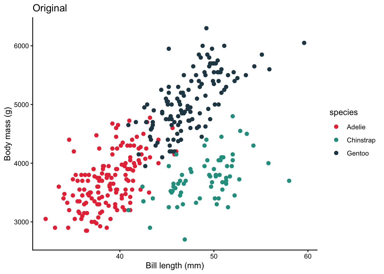
## Simulating Color Vision Deficiency
```{r}
#| label: cvd-simulation
# Create a base plot
p_base <- ggplot(penguins, aes(x = bill_length_mm, y = body_mass_g,
                                color = species)) +
  geom_point(size = 2, na.rm = TRUE) +
  scale_color_manual(values = c("Adelie" = "#E63946",
                                 "Chinstrap" = "#2A9D8F",
                                 "Gentoo" = "#264653")) +
  labs(x = "Bill length (mm)", y = "Body mass (g)") +
  theme_classic()

# Original
p_base + labs(title = "Original")
# Simulate deuteranopia (red-green deficiency)
# cvd_emulator() expects a file path, so save the plot to a temp file first
tmp_plot <- tempfile(fileext = ".png")
ggsave(tmp_plot, p_base + labs(title = "Simulated deuteranopia"),
       width = 7, height = 5, dpi = 150)
colorspace::cvd_emulator(tmp_plot)
```
If the simulated plot makes it hard to distinguish groups, switch to a CVD-safe palette such as viridis, `"Okabe-Ito"` (khroma), or Brewer's qualitative palettes.
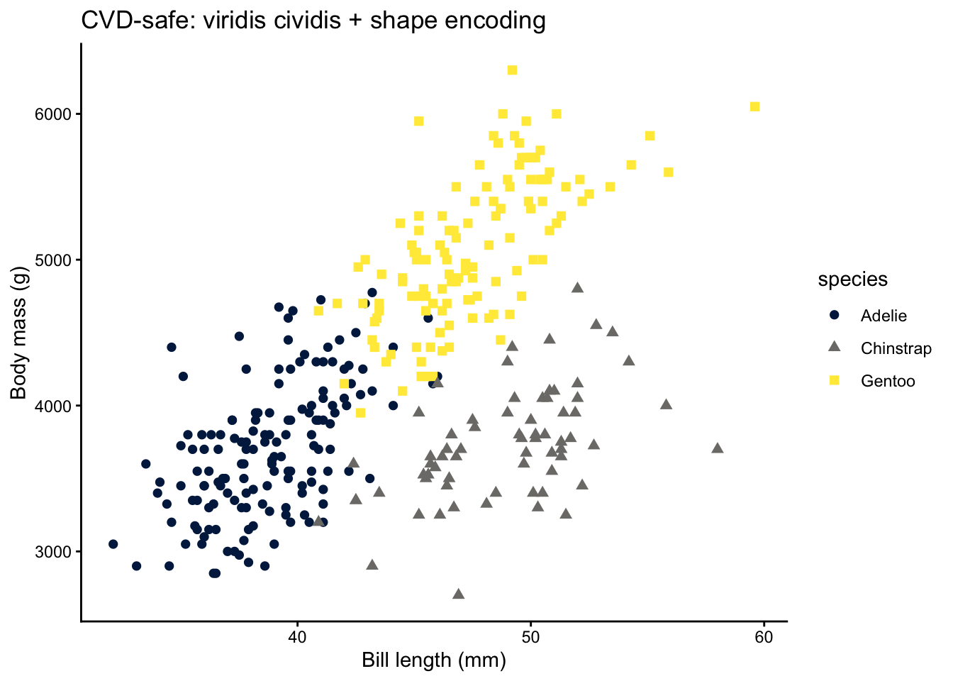
## A Safer Version
```{r}
#| label: cvd-safe
ggplot(penguins, aes(x = bill_length_mm, y = body_mass_g,
                      color = species, shape = species)) +
  geom_point(size = 2, na.rm = TRUE) +
  scale_color_viridis_d(option = "cividis") +
  labs(title = "CVD-safe: viridis cividis + shape encoding",
       x = "Bill length (mm)", y = "Body mass (g)") +
  theme_classic()
```
# Common Pitfalls
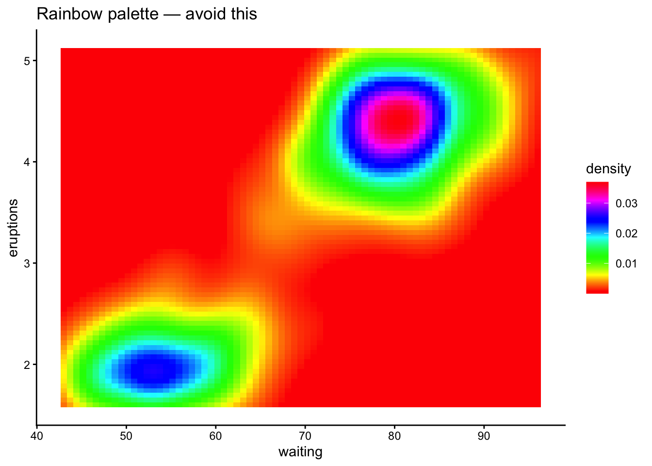
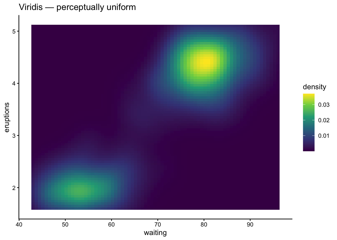
## Pitfall 1: The Rainbow Palette
Rainbow (jet) palettes are not perceptually uniform — yellow appears brighter than blue, creating false visual emphasis. They also fail under grayscale printing and for colorblind viewers.
```{r}
#| label: pitfall-rainbow
# Don't do this
ggplot(faithfuld, aes(waiting, eruptions, fill = density)) +
  geom_tile() +
  scale_fill_gradientn(colours = rainbow(256)) +
  labs(title = "Rainbow palette — avoid this") +
  theme_classic()
# Do this instead
ggplot(faithfuld, aes(waiting, eruptions, fill = density)) +
  geom_tile() +
  scale_fill_viridis_c() +
  labs(title = "Viridis — perceptually uniform") +
  theme_classic()
```
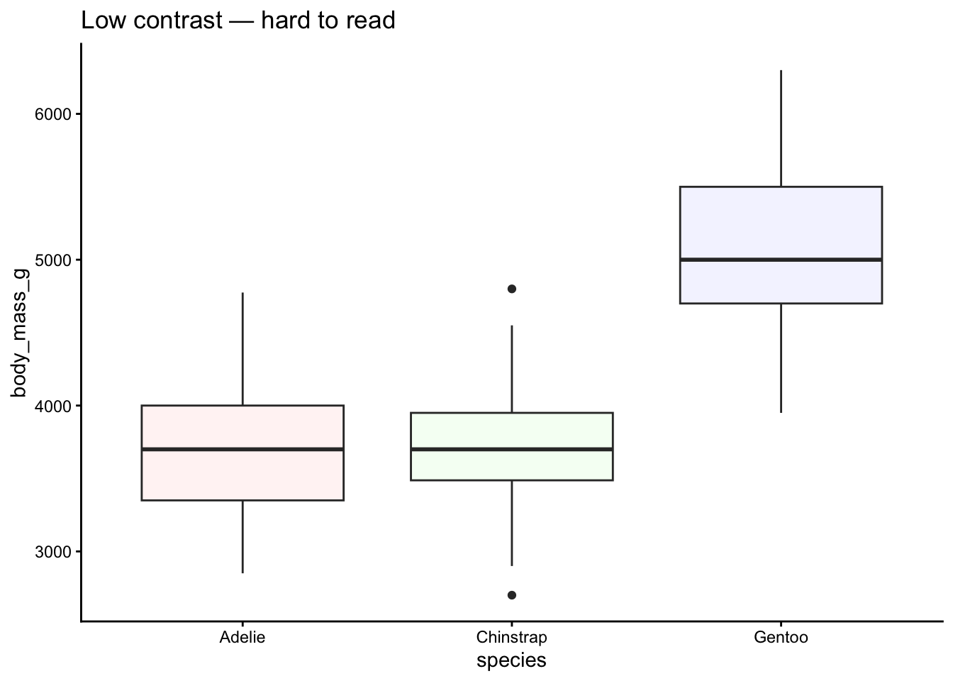
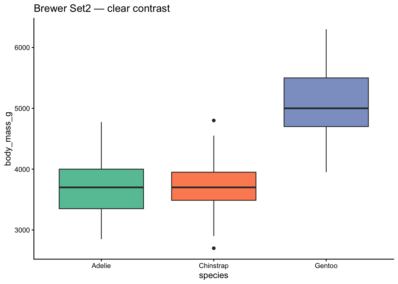
## Pitfall 2: Low-Contrast Palettes
Pastel-on-white palettes look washed out on screens and vanish when printed.
```{r}
#| label: pitfall-low-contrast
# Low contrast
ggplot(penguins, aes(x = species, y = body_mass_g, fill = species)) +
  geom_boxplot(na.rm = TRUE, show.legend = FALSE) +
  scale_fill_manual(values = c("#FFF5F5", "#F5FFF5", "#F5F5FF")) +
  labs(title = "Low contrast — hard to read") +
  theme_classic()
# Better contrast
ggplot(penguins, aes(x = species, y = body_mass_g, fill = species)) +
  geom_boxplot(na.rm = TRUE, show.legend = FALSE) +
  scale_fill_brewer(palette = "Set2") +
  labs(title = "Brewer Set2 — clear contrast") +
  theme_classic()
```
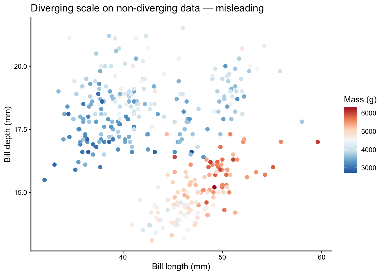
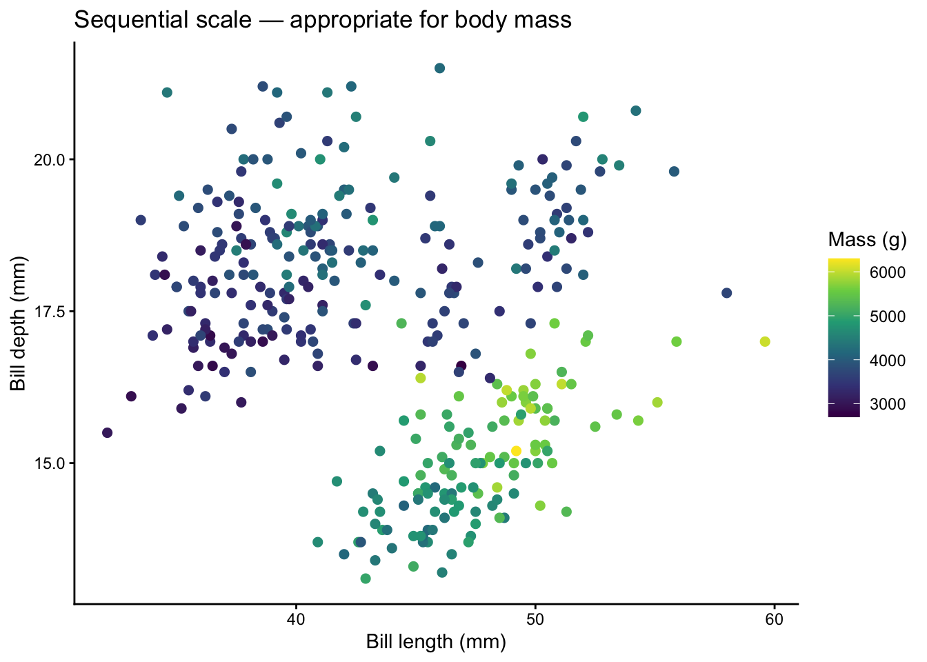
## Pitfall 3: Diverging Scales on Non-Diverging Data
Diverging palettes imply a meaningful midpoint (zero, average, threshold). Using them for data without a natural center misleads the reader.
```{r}
#| label: pitfall-diverging
# Misleading: diverging scale on body mass (no natural midpoint)
ggplot(penguins, aes(x = bill_length_mm, y = bill_depth_mm,
                      color = body_mass_g)) +
  geom_point(size = 2, na.rm = TRUE) +
  scale_color_distiller(palette = "RdBu") +
  labs(title = "Diverging scale on non-diverging data — misleading",
       x = "Bill length (mm)", y = "Bill depth (mm)",
       color = "Mass (g)") +
  theme_classic()
# Correct: sequential scale
ggplot(penguins, aes(x = bill_length_mm, y = bill_depth_mm,
                      color = body_mass_g)) +
  geom_point(size = 2, na.rm = TRUE) +
  scale_color_viridis_c() +
  labs(title = "Sequential scale — appropriate for body mass",
       x = "Bill length (mm)", y = "Bill depth (mm)",
       color = "Mass (g)") +
  theme_classic()
```
## Pitfall 4: Too Many Categories
We covered this above, but it bears repeating: if your legend has more than 8 entries, rethink your encoding strategy. Lump, facet, highlight, or use a different visual channel.
# Palette Checklist
Before you finalize a figure, run through this checklist:
| # | Question | Action if "No" |
|---|----------|----------------|
| 1 | Is the variable continuous or discrete? | Switch scale type |
| 2 | Does the palette type match the data? (sequential / diverging / qualitative) | Change palette family |
| 3 | Are there 8 or fewer color categories? | Lump, facet, or highlight |
| 4 | Is the palette colorblind-safe? | Use viridis, scico, or khroma |
| 5 | Does the plot read in grayscale? | Use a perceptually uniform palette |
| 6 | Is there enough contrast against the background? | Darken colors or switch palette |
| 7 | Are NAs handled intentionally? | Set `na.value =` explicitly |
| 8 | Is color the only encoding? | Add shape, size, or labels as backup |
# Quick Reference: Which Package When?
| Package | Best for | Continuous | Discrete |
|---------|----------|:----------:|:--------:|
| **viridis** | Safe default, heatmaps | Yes | Yes |
| **RColorBrewer** | Publication-ready, classic | Yes | Yes |
| **colorspace** | Custom HCL palettes, diagnostics | Yes | Yes |
| **paletteer** | Browsing many packages at once | Yes | Yes |
| **scico** | Scientific maps, earth science | Yes | Yes |
| **MetBrewer** | Artistic, striking figures | Yes | Yes |
| **wesanderson** | Fun, informal graphics | No | Yes |
| **ggsci** | Journal-style figures | No | Yes |
| **rcartocolor** | Cartography, spatial data | Yes | Yes |
| **khroma** | Accessibility-first science | Yes | Yes |
# Wrapping Up
There is no single "best" palette — but there are wrong ones. Start with **viridis** as a safe default, reach for **RColorBrewer** when you need classic publication palettes, and explore **MetBrewer**, **scico**, or **khroma** when you want something that is both beautiful and accessible. Always test for colorblind safety, keep your categories under 8, and never rely on color alone.
Happy plotting!